Photoshop Color Correction

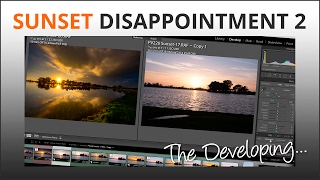
Check out these two images. The top one looks kind of dull and it’s because the colours are not very nice. There’s a bluey tinge to it. Whereas the bottom one is much more pleasing.
When I was learning photography with film it took me a very long time indeed to realise some of the images I'd taken and despaired over were ruined by the person at a local mini-lab because they'd made a balls-up of color correction when they printed the negative.
I even threw away the negs of a thunderstorm over the Isle of Wight which I now know would have been awesome if the color correction had been done properly.
Photoshop’s color correction tools range from automatic to manual but the auto system doesn’t know how you want the image to look. It can only ‘correct’ according to the colours Photoshop programmers have told it the average picture contains. So it’s important for you to know how to do it yourself to get the image looking the way you want it to.
There are two sides to color correction what’s accurate and what’s pleasing, but accurate colours may not necessarily look nice. These two images demonstrate this perfectly because the top one is accurate!
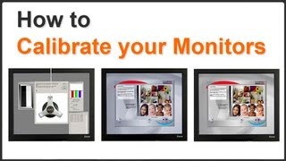
So when should you be accurate and when can you be more creative? And where do you begin? The first step is to get your white balance right when you shoot the image and the second is to ensure your monitor is calibrated or you’re on a hiding to nothing.
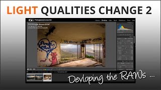
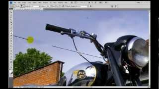
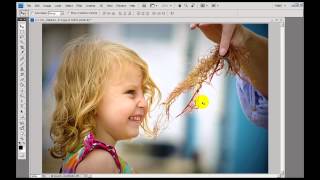
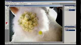
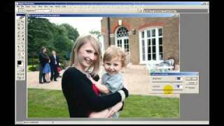
In this video we’ll show you how to use Photoshop colour correction tools to get bright pleasing images that work. You can download the images I’m working on so you can see the difference on your own screen. If the corrected ones look wrong - your monitor needs calibrating!